
Saving the Build: Redirecting Resources to What Mattered
The Problem: A hackathon winner. Internal excitement. A feature ready to be designed and built.
The idea was to have a Quick Pay shortcut that let users save payment details for faster repeat transactions to the same person. The only thing missing was evidence that anyone actually wanted it.
The Business Risk: The team was ready to move straight to development. I pushed to test the design first although nobody thought it was necessary. Since there was no extra budget for this, I piggybacked on a research study already in progress to do it without adding extra cost.
My Role: Advocated for and led user testing before a single line of code was written. Research revealed that users didn't see value in Quick Pay — the time saving was minimal, the payments weren't frequent enough, and saving fixed details didn't match how they actually paid. What they wanted was smarter access to recent payees — something far simpler to build and far more useful.
Outcome: Resources were refocused. The right feature got built instead.

Client
Virgin Money | ME Bank | Bank of Queensland
Role
Lead Researcher | Product Designer
Stakeholders
Development Lead | Product Team | Design Lead
/ Context
3
banks, same broken payment flow
>99
%
of transactions handled manually · repeat payees, same friction every time
50
%
of manual transactions abandoned · clunky flow, lost completions
How might we simplify frequent payments to the same person when amounts or timing can’t be fixed?
/ Discovery
Testing the Assumption Before the Build
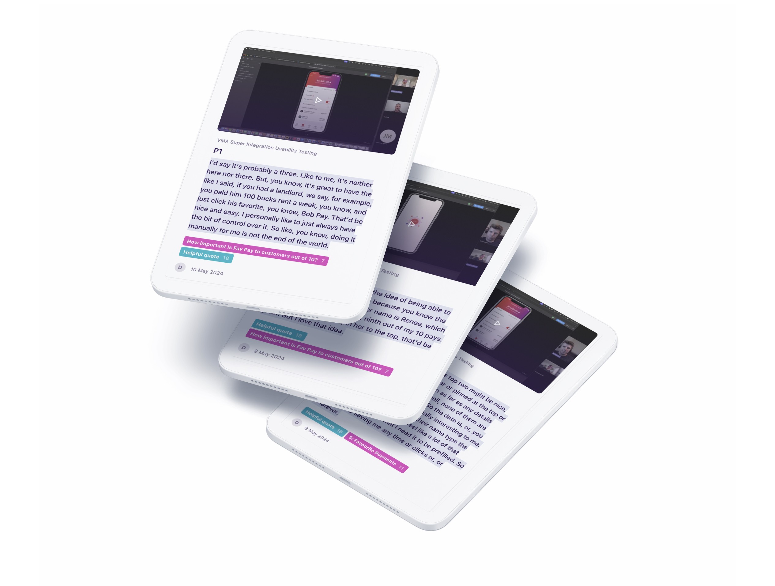
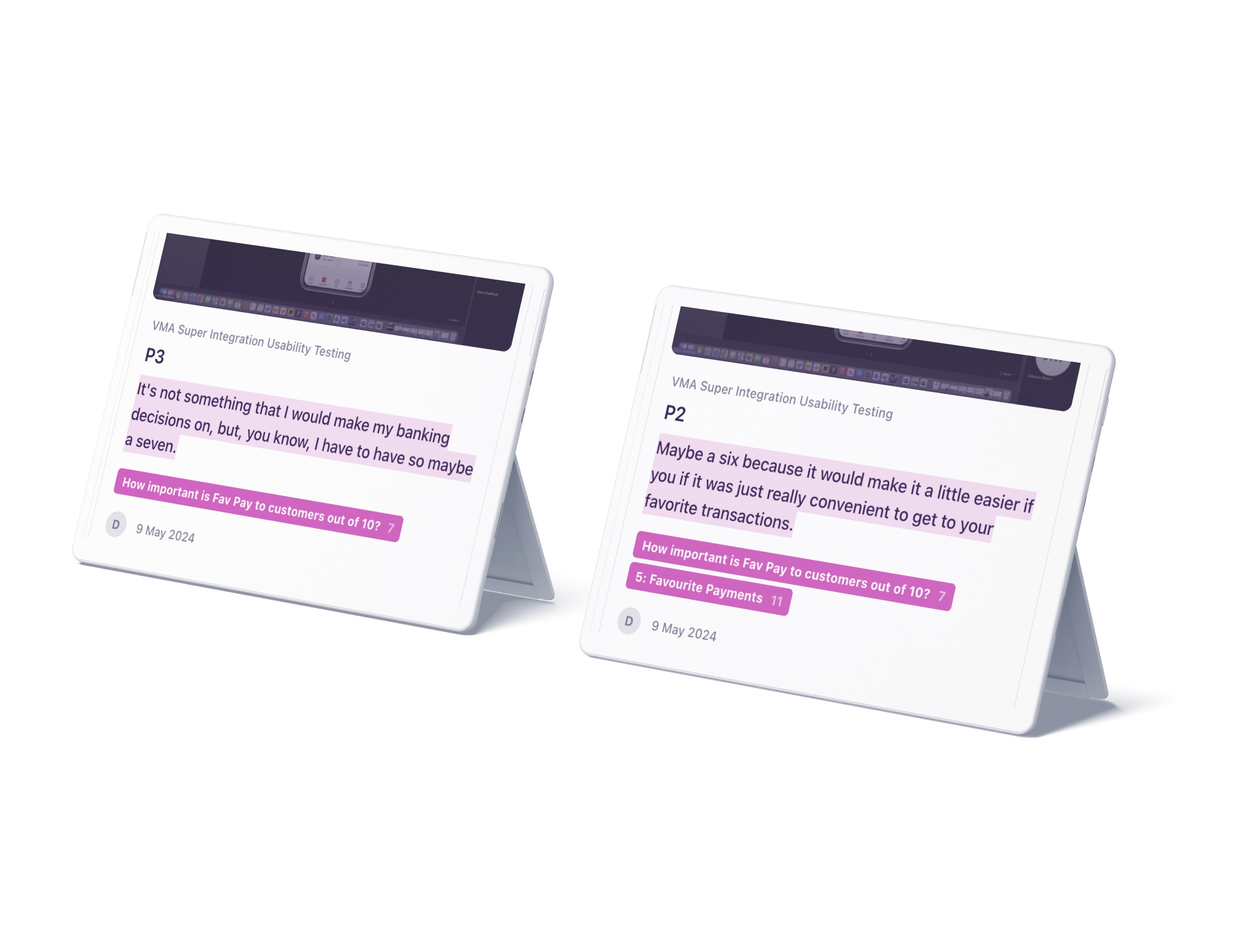
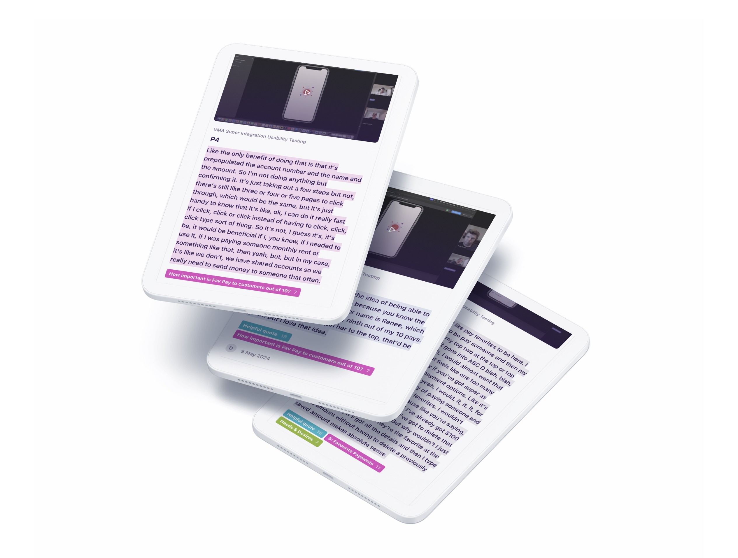
I planned and led end-to-end user research to test interest, behaviours, and usability for the proposed feature.
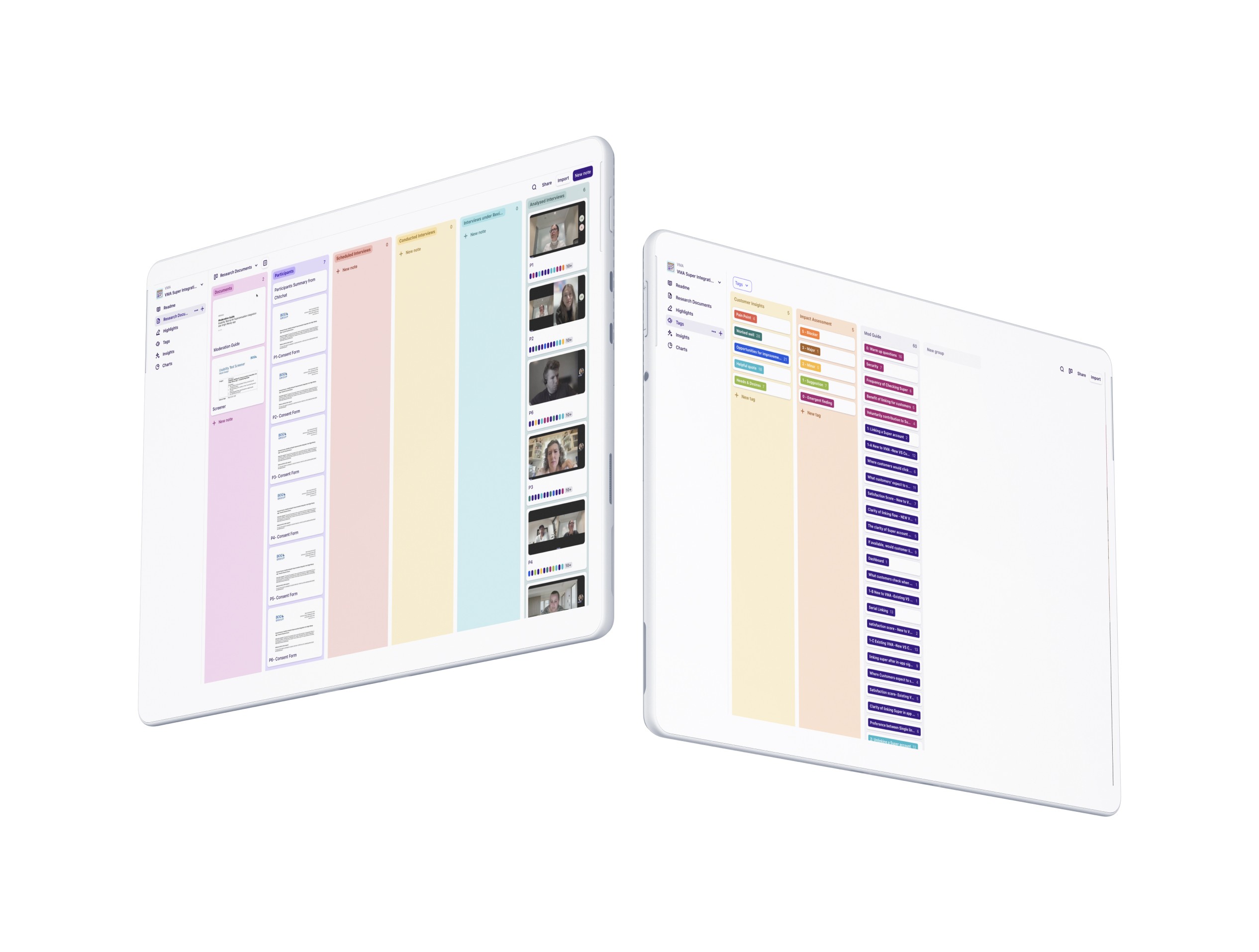
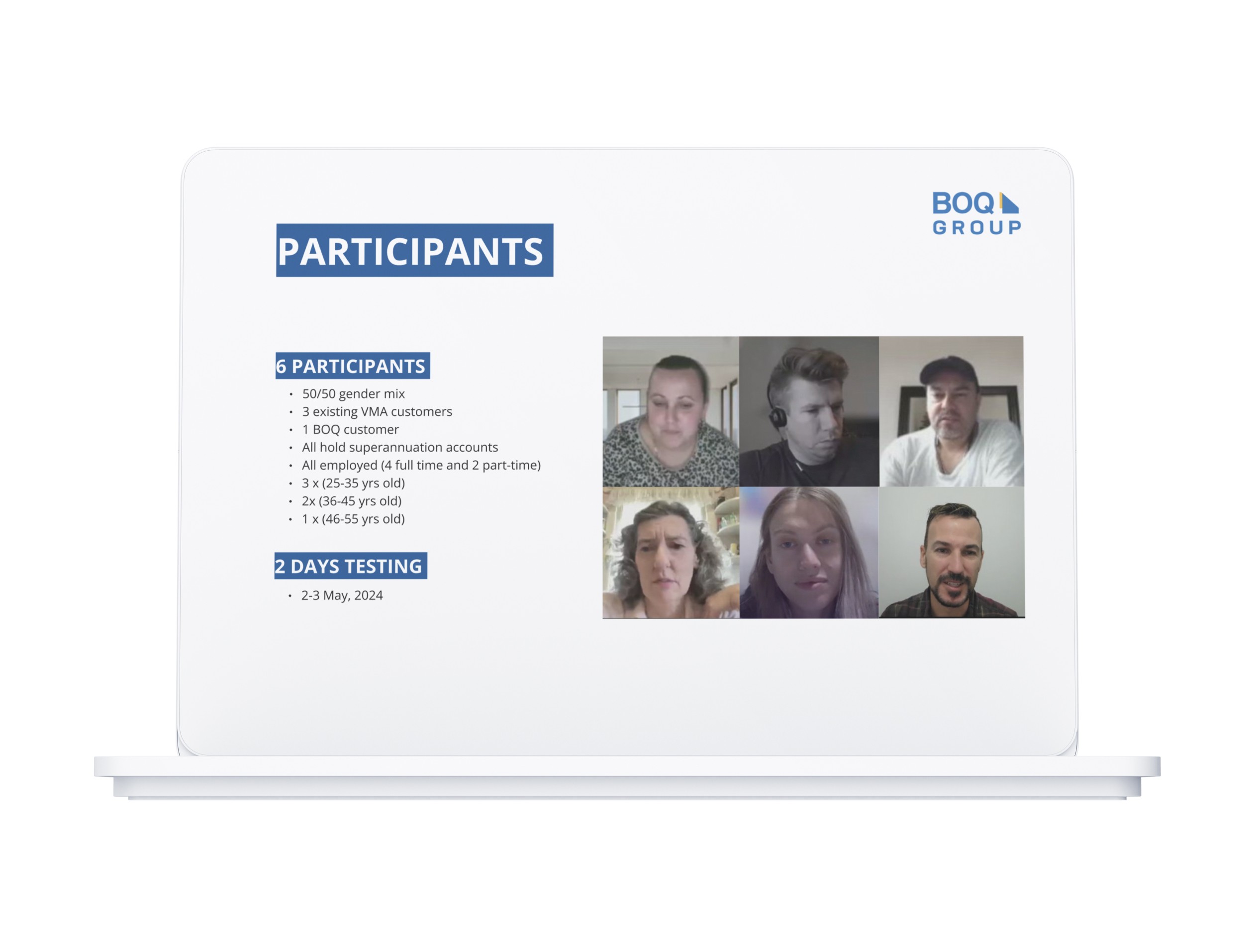
Participant Recruitment: Created screeners and recruited 6 participants through ChitChat.
Testing Set Up: Prepared Dovetail templates and moderation guide for consistent testing.
Moderated Testing for Real-Time Insight
I facilitated all sessions to understand: a) how often users repeat payments, b) what they value in managing payees, and c) their concerns around saving payment data.
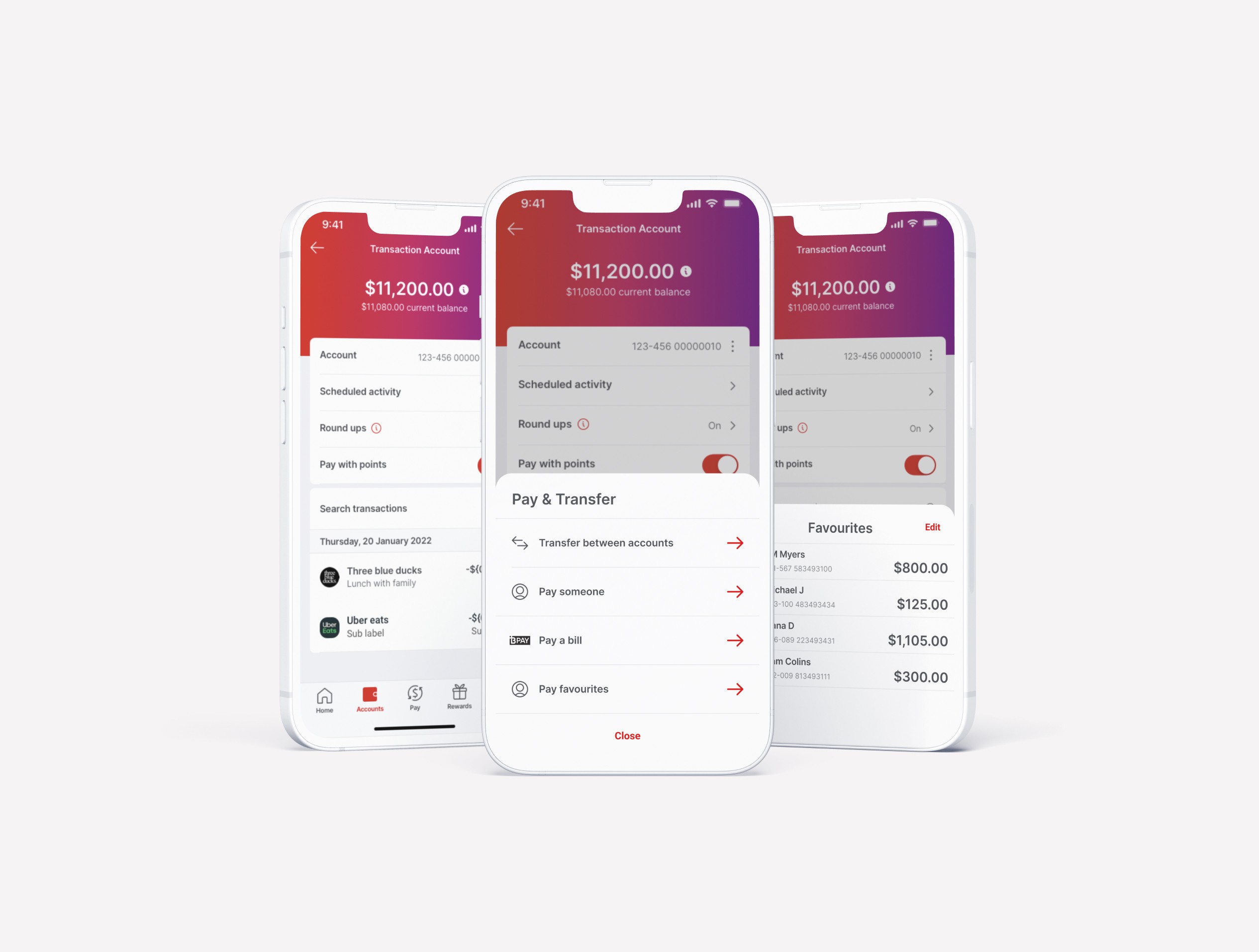
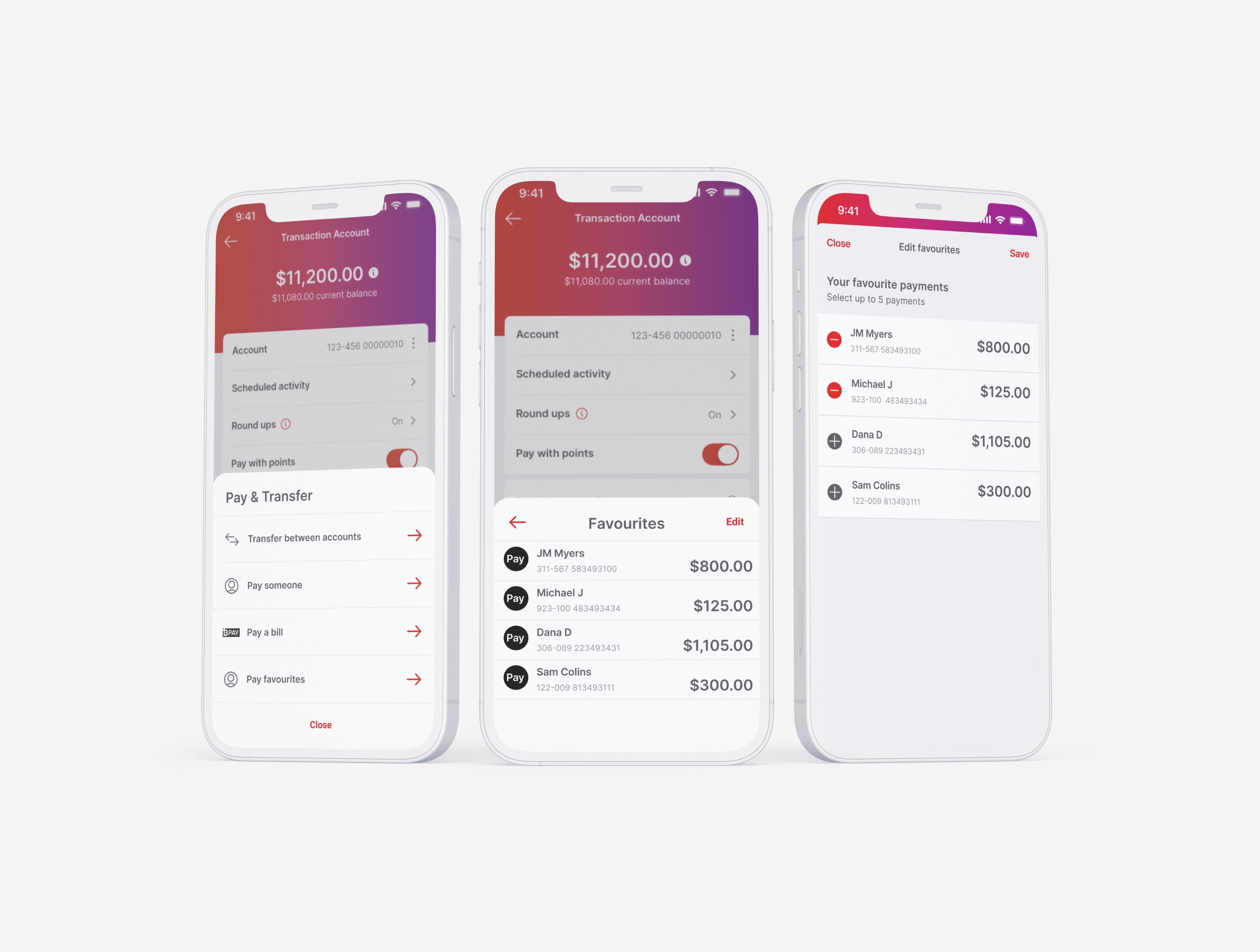
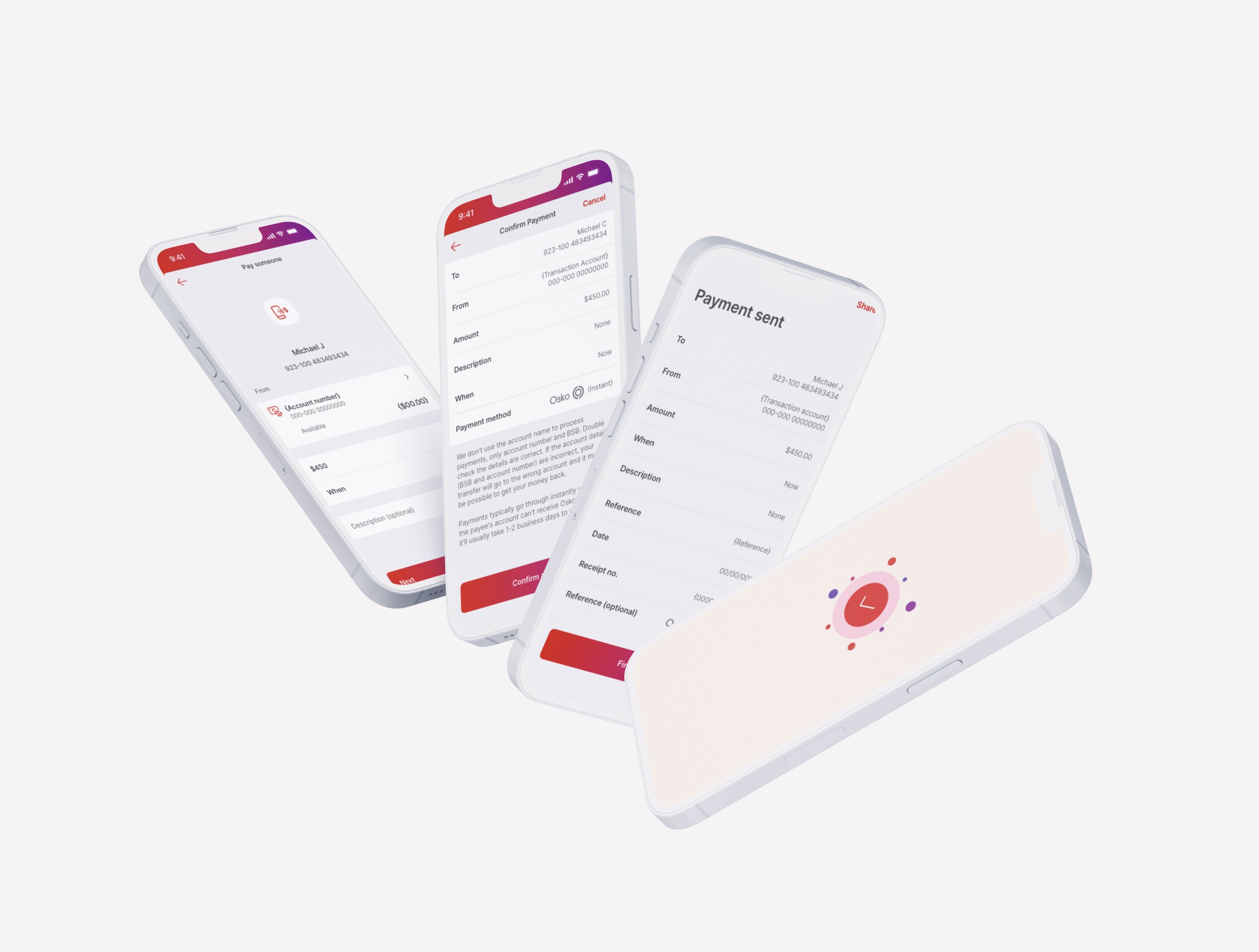
Prototyping: I designed alternative payment flows in Figma to test whether Quick Pay solved a real problem or just assumed one.
Synthesis
Post-research, I tagged and analysed all insights in Dovetail. Patterns emerged quickly: the hypothesis didn't hold. User needs pointed somewhere else entirely.
Recent Payees Over Favourites
Theme
“I don’t want to create favourites. I just want the app to remember who I paid last time.”
User Insight
The Rise of PAYID
Theme
“I use PAYID almost every time, have to enter it every time I send money. It would be much easier if I could just save it like a regular account.”
User Insight
Variable Payment Patterns
Theme
“I like the idea of saving the person’s details, but I don’t always send the same amount. I’d rather just see my recent payees.”
User Insight
Users didn't see value in Quick Pay. The time saving was minimal, payments weren't frequent enough, and fixed details didn't match how they actually paid. What they wanted was smarter access to recent payees.
Stakeholder Collaboration: I presented findings directly to the team and product lead, making the case to redirect resources before a single line of code was written.
/ Design
Pivoting Based on Real User Needs
Research revealed that users simply wanted the app to remember who they paid last. This shifted focus from Quick Pay to enhancing Recent Payees within the Address Book.
/ Impact
Smarter Payee Access
Research confirmed users wanted quick access to recent payees, not saved fixed details. The redesigned flow addressed exactly that.
PAYID as a Priority
Users consistently raised PAYID as an unmet need. Saving PAYID details at the end of the payment flow became a validated feature requirement
Validated Feature Direction
Usability testing revealed strong user interest in the improvements, particularly the ease of finding and using recent payees, pointing to a smoother, more intuitive payment flow.
/ Reflection
Navigating Stakeholder Expectations
With varied perspectives and limited product context in the room, I led with research-backed recommendations that balanced user needs with business priorities. By grounding decisions in evidence, I helped align stakeholders and bring clarity to the path forward.
Doing More with Less
I piggybacked on an existing usability study to test this feature without additional budget, staying evidence-led and resource-efficient without delaying the timeline.
Maturing Research in Agile Teams
This case helped elevate research maturity—demonstrating that good insights save time and guide smarter product decisions.


Saving the Build: Redirecting Resources to What Mattered
The Problem: A hackathon winner. Internal excitement. A feature ready to be designed and built.
The idea was to have a Quick Pay shortcut that let users save payment details for faster repeat transactions to the same person. The only thing missing was evidence that anyone actually wanted it.
The Business Risk: The team was ready to move straight to development. I pushed to test the design first although nobody thought it was necessary. Since there was no extra budget for this, I piggybacked on a research study already in progress to do it without adding extra cost.
My Role: Advocated for and led user testing before a single line of code was written. Research revealed that users didn't see value in Quick Pay — the time saving was minimal, the payments weren't frequent enough, and saving fixed details didn't match how they actually paid. What they wanted was smarter access to recent payees — something far simpler to build and far more useful.
Outcome: Resources were refocused. The right feature got built instead.
Client
Virgin Money | ME Bank | Bank of Queensland
Role
Lead Researcher | Product Designer
Stakeholders
Development Lead | Product Team | Design Lead
/ Context
3
Complex Products, 3 Brands, 2 Platforms
>99
%
of transactions handled manually · repeat payees, same friction every time
50
%
of manual transactions abandoned · clunky flow, lost completions
How might we simplify frequent payments to the same person when amounts or timing can’t be fixed?
/ Discovery
Testing the Assumption Before the Build
I planned and led end-to-end user research to test interest, behaviours, and usability for the proposed feature.
Participant Recruitment: Created screeners and recruited 6 participants through ChitChat.
Testing Set Up: Prepared Dovetail templates and moderation guide for consistent testing.
Moderated Testing for Real-Time Insight
I facilitated all sessions to understand: a) how often users repeat payments, b) what they value in managing payees, and c) their concerns around saving payment data.
Prototyping: I designed alternative payment flows in Figma to test whether Quick Pay solved a real problem or just assumed one.
Synthesis
Post-research, I tagged and analysed all insights in Dovetail. Patterns emerged quickly: the hypothesis didn't hold. User needs pointed somewhere else entirely.
Recent Payees Over Favourites
Theme
“I don’t want to create favourites. I just want the app to remember who I paid last time.”
User Insight
The Rise of PAYID
Theme
“I use PAYID almost every time, have to enter it every time I send money. It would be much easier if I could just save it like a regular account.”
User Insight
Variable Payment Patterns
Theme
“I like the idea of saving the person’s details, but I don’t always send the same amount. I’d rather just see my recent payees.”
User Insight
Users didn't see value in Quick Pay. The time saving was minimal, payments weren't frequent enough, and fixed details didn't match how they actually paid. What they wanted was smarter access to recent payees.
Stakeholder Collaboration: I presented findings directly to the team and product lead, making the case to redirect resources before a single line of code was written.
/ Design
Pivoting Based on Real User Needs
Research revealed that users simply wanted the app to remember who they paid last. This shifted focus from Quick Pay to enhancing Recent Payees within the Address Book.
/ Impact
Smarter Payee Access
Research confirmed users wanted quick access to recent payees, not saved fixed details. The redesigned flow addressed exactly that.
PAYID as a Priority
Users consistently raised PAYID as an unmet need. Saving PAYID details at the end of the payment flow became a validated feature requirement
Validated Feature Direction
Usability testing revealed strong user interest in the improvements, particularly the ease of finding and using recent payees, pointing to a smoother, more intuitive payment flow.
/ Reflection
Navigating Stakeholder Expectations
With varied perspectives and limited product context in the room, I led with research-backed recommendations that balanced user needs with business priorities. By grounding decisions in evidence, I helped align stakeholders and bring clarity to the path forward.
Doing More with Less
I piggybacked on an existing usability study to test this feature without additional budget, staying evidence-led and resource-efficient without delaying the timeline.
Maturing Research in Agile Teams
This case helped elevate research maturity—demonstrating that good insights save time and guide smarter product decisions.
Saving the Build: Redirecting Resources to What Mattered
The Problem: A hackathon winner. Internal excitement. A feature ready to be designed and built.
The idea was to have a Quick Pay shortcut that let users save payment details for faster repeat transactions to the same person. The only thing missing was evidence that anyone actually wanted it.
The Business Risk: The team was ready to move straight to development. I pushed to test the design first although nobody thought it was necessary. Since there was no extra budget for this, I piggybacked on a research study already in progress to do it without adding extra cost.
My Role: Advocated for and led user testing before a single line of code was written. Research revealed that users didn't see value in Quick Pay — the time saving was minimal, the payments weren't frequent enough, and saving fixed details didn't match how they actually paid. What they wanted was smarter access to recent payees — something far simpler to build and far more useful.
Outcome: Resources were refocused. The right feature got built instead.
Client
Virgin Money | ME Bank | Bank of Queensland
Role
Lead Researcher | Product Designer
Stakeholders
Development Lead | Product Team | Design Lead
/ Context
3
banks, same broken payment flow
>99
%
of transactions handled manually · repeat payees, same friction every time
50
%
of manual transactions abandoned · clunky flow, lost completions
How might we simplify frequent payments to the same person when amounts or timing can’t be fixed?
/ Discovery
Testing the Assumption Before the Build
I planned and led end-to-end user research to test interest, behaviours, and usability for the proposed feature.
Participant Recruitment: Created screeners and recruited 6 participants through ChitChat.
Testing Set Up: Prepared Dovetail templates and moderation guide for consistent testing.
Moderated Testing for Real-Time Insight
I facilitated all sessions to understand: a) how often users repeat payments, b) what they value in managing payees, and c) their concerns around saving payment data.
Prototyping: I designed alternative payment flows in Figma to test whether Quick Pay solved a real problem or just assumed one.
Synthesis
Post-research, I tagged and analysed all insights in Dovetail. Patterns emerged quickly: the hypothesis didn't hold. User needs pointed somewhere else entirely.
Recent Payees Over Favourites
Theme
“I don’t want to create favourites. I just want the app to remember who I paid last time.”
User Insight
The Rise of PAYID
Theme
“I use PAYID almost every time, have to enter it every time I send money. It would be much easier if I could just save it like a regular account.”
User Insight
Variable Payment Patterns
Theme
“I like the idea of saving the person’s details, but I don’t always send the same amount. I’d rather just see my recent payees.”
User Insight
Users didn't see value in Quick Pay. The time saving was minimal, payments weren't frequent enough, and fixed details didn't match how they actually paid. What they wanted was smarter access to recent payees.
Stakeholder Collaboration: I presented findings directly to the team and product lead, making the case to redirect resources before a single line of code was written.
/ Design
Pivoting Based on Real User Needs
Research revealed that users simply wanted the app to remember who they paid last. This shifted focus from Quick Pay to enhancing Recent Payees within the Address Book.
/ Impact
Smarter Payee Access
Research confirmed users wanted quick access to recent payees, not saved fixed details. The redesigned flow addressed exactly that.
PAYID as a Priority
Users consistently raised PAYID as an unmet need. Saving PAYID details at the end of the payment flow became a validated feature requirement
Validated Feature Direction
Usability testing revealed strong user interest in the improvements, particularly the ease of finding and using recent payees, pointing to a smoother, more intuitive payment flow.
/ Reflection
Navigating Stakeholder Expectations
With varied perspectives and limited product context in the room, I led with research-backed recommendations that balanced user needs with business priorities. By grounding decisions in evidence, I helped align stakeholders and bring clarity to the path forward.
Doing More with Less
I piggybacked on an existing usability study to test this feature without additional budget, staying evidence-led and resource-efficient without delaying the timeline.
Maturing Research in Agile Teams
This case helped elevate research maturity—demonstrating that good insights save time and guide smarter product decisions.