
From Angry Calls to Self-Serve Clarity: Bonus Interest Tracker
The Problem: The call centre was overwhelmed by customers calling to ask about their bonus interest to see if they qualified or why haven't they got paid. Those calls were costly, time-consuming, and left customers more frustrated than before.
The Business Impact: Bonus interest queries were a small share of total complaints, but disproportionately expensive. Each one required individual handling, draining call centre capacity and driving down App Store ratings across all three brands.
My Role: I led the end-to-end research and synthesis that revealed some compounding failures:
Unclear eligibility criteria
Invisible progress tracking
No payment timeline
The criteria itself was genuinely complex and transparency alone couldn't solve it.
The Outcome: From those findings I designed, iterated and delivered a self-service clarity tracker across 3 brands and 5 products. This was the first time customers had visibility, control and confidence in one place. Research also gave the business evidence that the remaining confusion wasn't a design failure, but a product complexity problem. Two outcomes. One solved through design. One handed to the business as a strategic decision.

Client
Virgin Money | ME Bank | Bank of Queensland
Role
Lead Researcher | UX/UI Designer
Stakeholders
Product Lead | Development Lead | Design Lead | Compliance Team
/ Context
3
banks, same broken payment flow
>99
%
of transactions handled manually · repeat payees, same friction every time
50
%
of manual transactions abandoned · clunky flow, lost completions
How might we help customers stay on track to earn their bonus, without needing to call for help?
/ Discovery
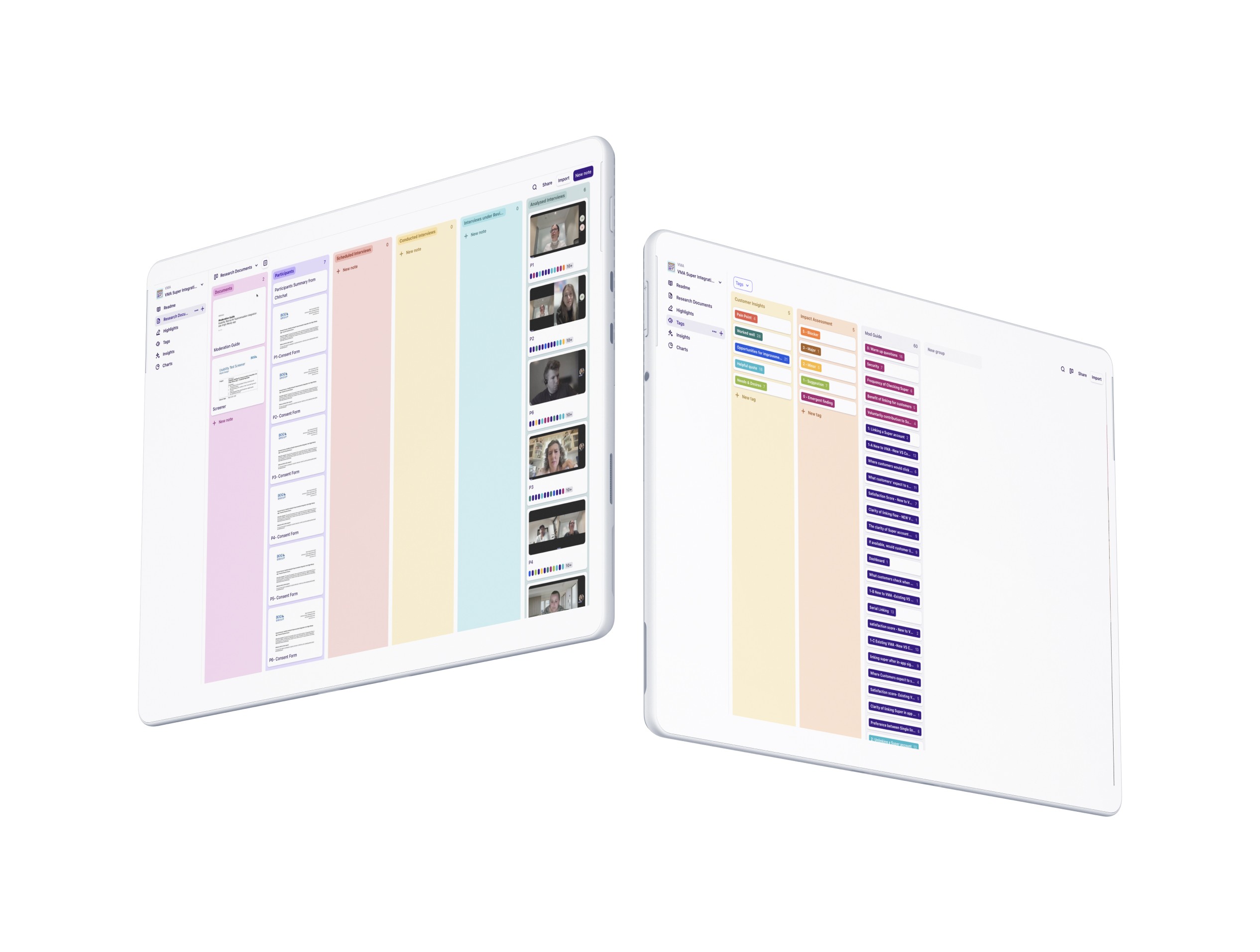
Experience Mapping
We mapped the product criteria and user journey to identify friction points in tracking bonus interest. By analysing app interactions, call centre logs, and user feedback, we uncovered transparency gaps that led to confusion and high support demand. These insights shaped our design hypothesis.
Competitor Analysis
We audited 5 competitor banking apps to benchmark how the market handled bonus interest visibility. The gap was clear: most competitors either lacked a tracker entirely or buried eligibility criteria. That absence validated the opportunity, and the table below shows exactly where the market fell short.
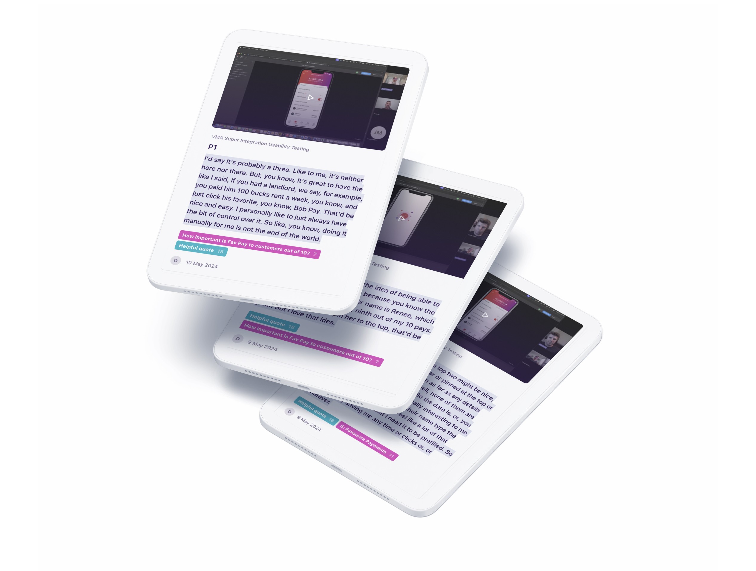
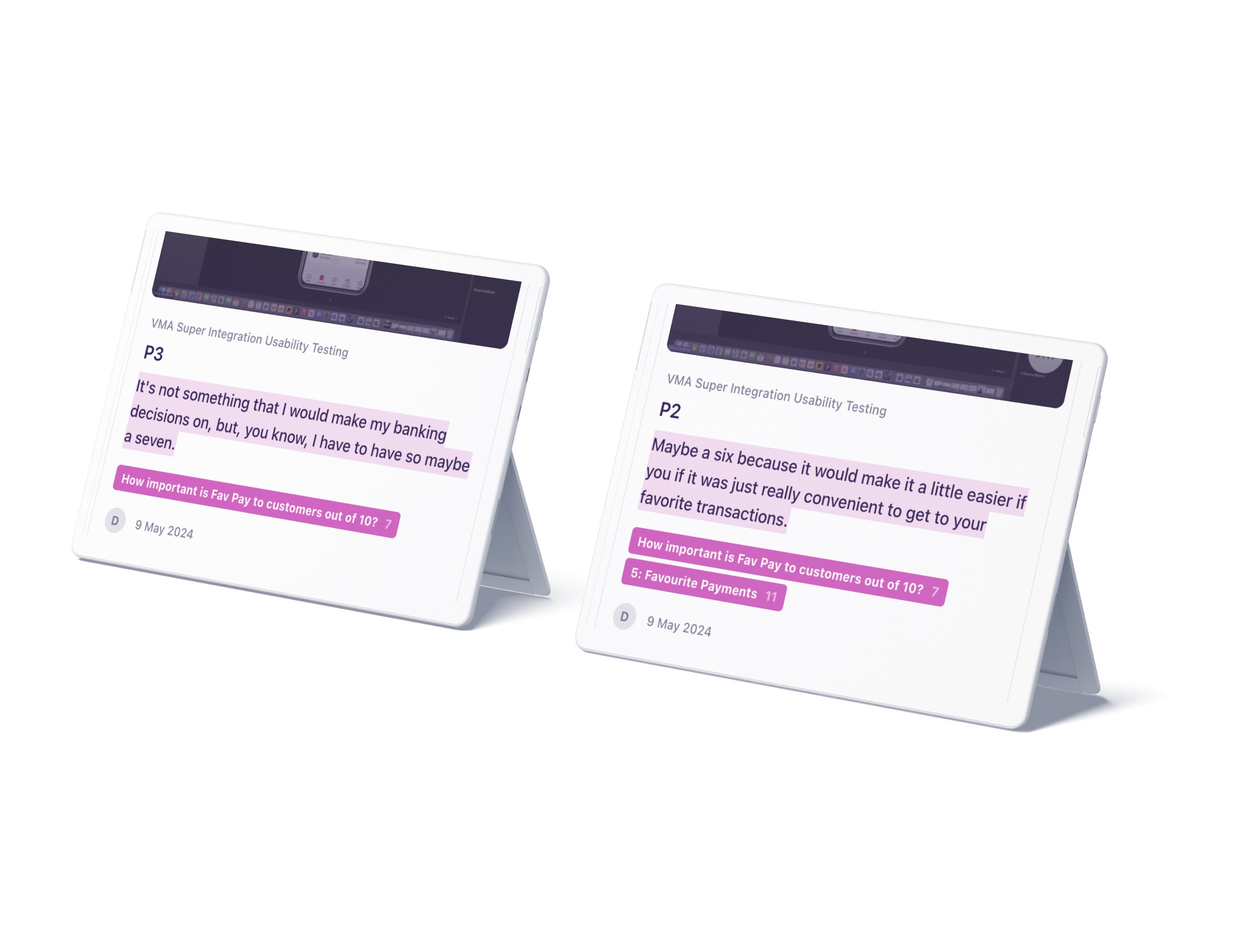
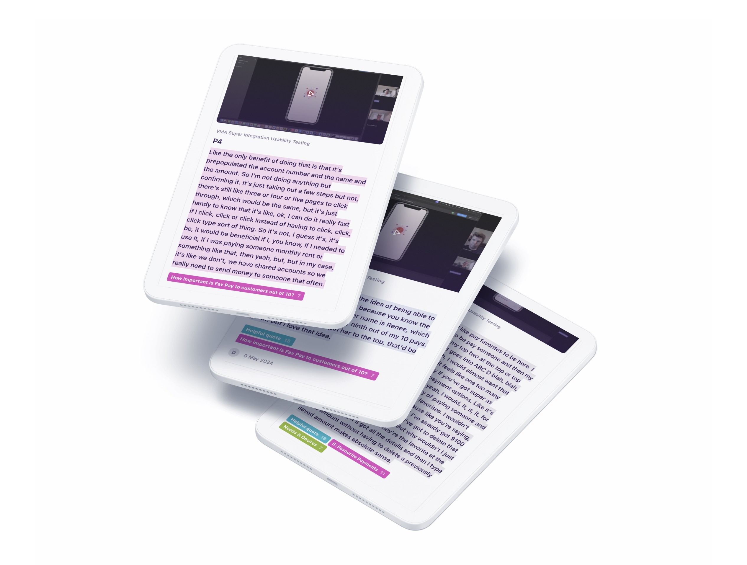
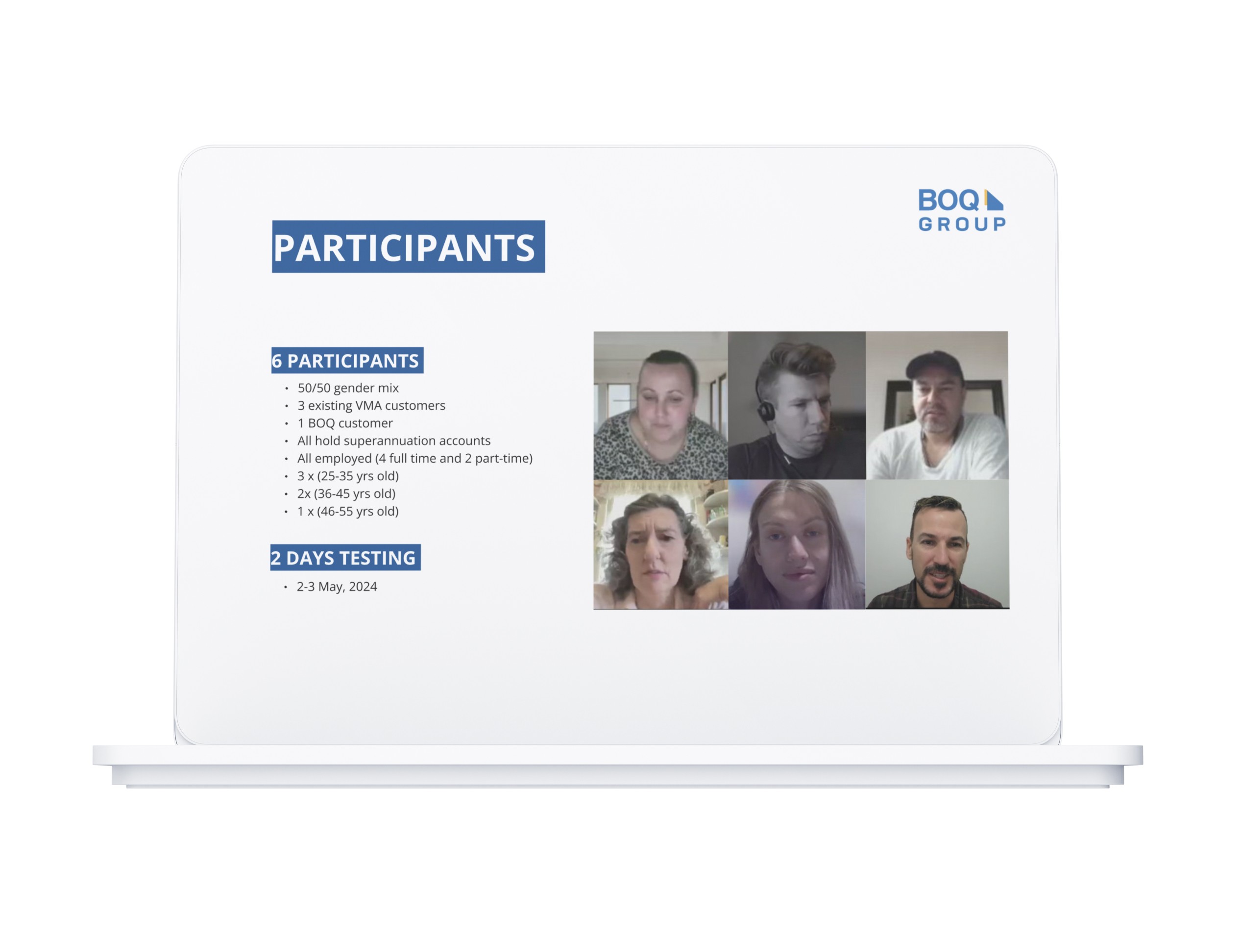
Usability Testing
I recruited and led 6 moderated sessions across 8 prototype variations. Users valued the visual tracker and understood each element in isolation, but couldn't connect the criteria, timeline, and tracker into a coherent picture. The hierarchy wasn't guiding them through the information gradually. That insight shifted the iteration priority from visual refinement to information architecture.
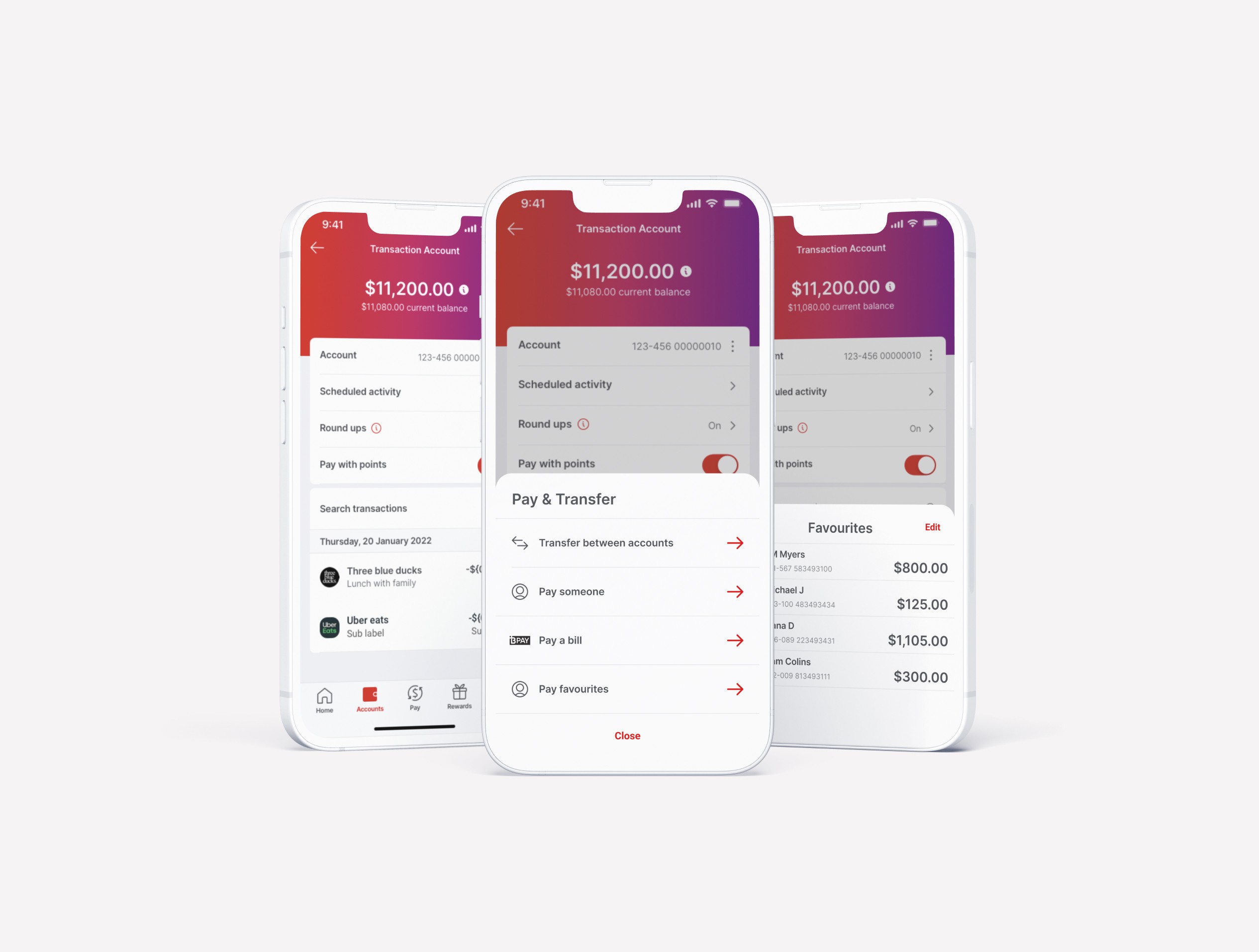
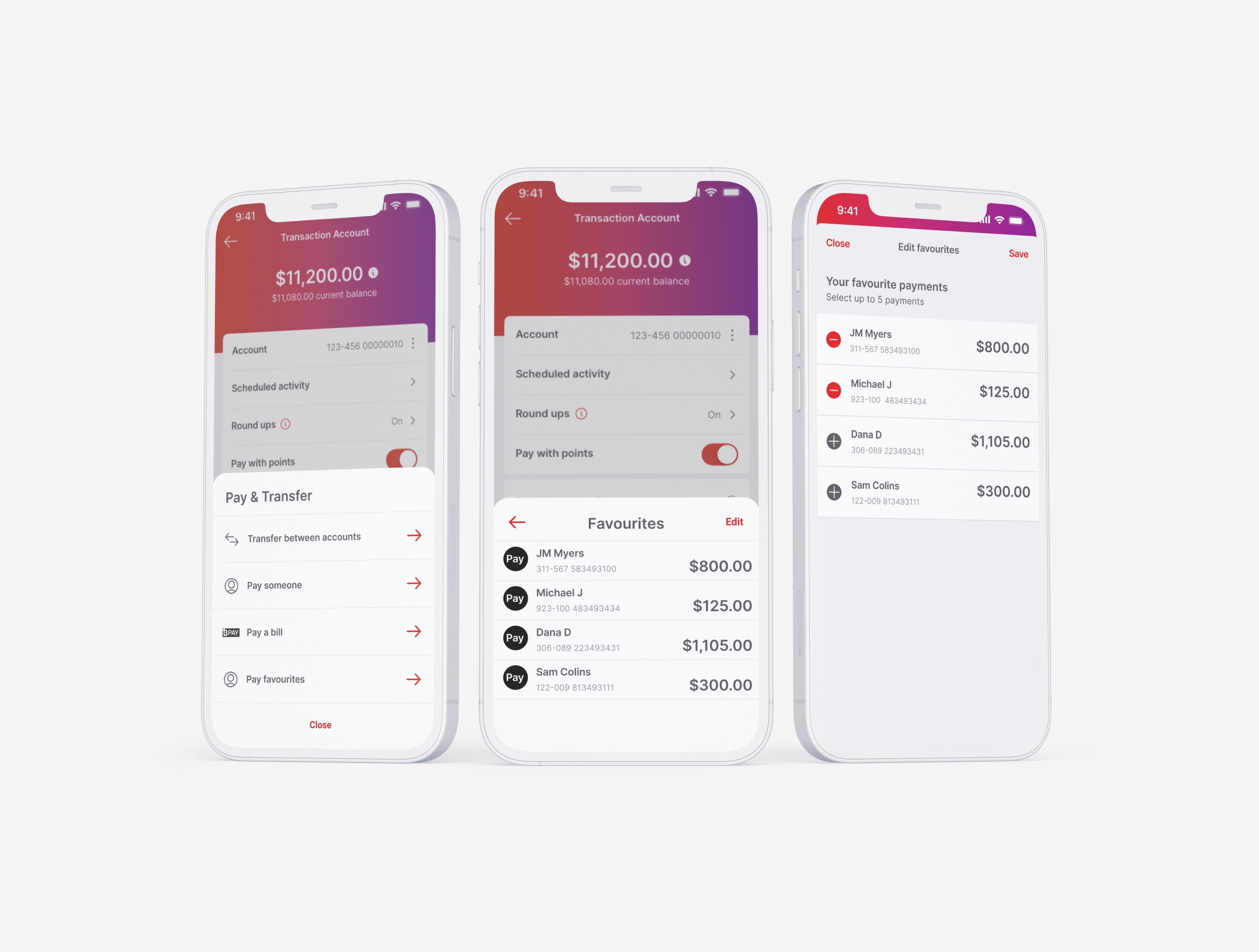
Recent Payees Over Favourites
Theme
“I don’t want to create favourites. I just want the app to remember who I paid last time.”
User Insight
The Rise of PAYID
Theme
“I use PAYID almost every time, have to enter it every time I send money. It would be much easier if I could just save it like a regular account.”
User Insight
Variable Payment Patterns
Theme
“I like the idea of saving the person’s details, but I don’t always send the same amount. I’d rather just see my recent payees.”
User Insight
Users loved the visual tracker, but struggled to piece together fragmented copy, navigate the cluttered layout, and follow unclear instructions.
Prototyping
We then designed a series of prototypes in preparation for usability testing.
/ Design
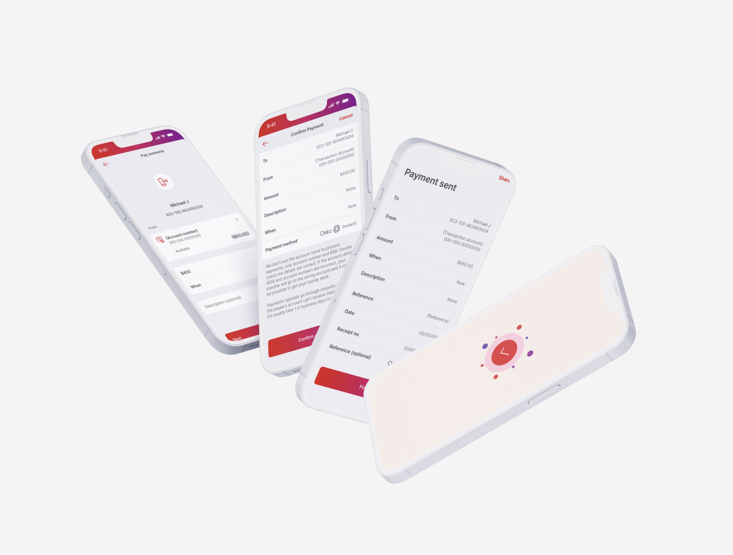
Redesigned for clarity, usability, and actionability
I led and executed each design iteration based on a specific research finding. The priority was information hierarchy first, making the criteria, timeline, and tracker readable as a connected system before refining the visual layer.

Edge Cases
Not all users fit the standard flow. I designed for welcome bonus recipients and under-18 accounts among other edge cases that would have created confusion or exclusion if left unaddressed.
Design Hand-off
I worked directly with the senior UI designer to adapt the tracker across three brand design systems, and aligned with developers early to surface feasibility constraints before final handover, not after.
/ Impact
Before handover, I defined what success would look like for the business:
Smarter Payee Access
Research confirmed users wanted quick access to recent payees, not saved fixed details. The redesigned flow addressed exactly that.
PAYID as a Priority
Users consistently raised PAYID as an unmet need. Saving PAYID details at the end of the payment flow became a validated feature requirement
Validated Feature Direction
Usability testing revealed strong user interest in the improvements, particularly the ease of finding and using recent payees, pointing to a smoother, more intuitive payment flow.
/ Reflection
Navigating Stakeholder Expectations
With varied perspectives and limited product context in the room, I led with research-backed recommendations that balanced user needs with business priorities. By grounding decisions in evidence, I helped align stakeholders and bring clarity to the path forward.
Doing More with Less
I piggybacked on an existing usability study to test this feature without additional budget, staying evidence-led and resource-efficient without delaying the timeline.
Maturing Research in Agile Teams
This case helped elevate research maturity—demonstrating that good insights save time and guide smarter product decisions.

From Angry Calls to Self-Serve Clarity: Bonus Interest Tracker
The Problem: The call centre was overwhelmed by customers calling to ask about their bonus interest to see if they qualified or why haven't they got paid. Those calls were costly, time-consuming, and left customers more frustrated than before.
The Business Impact: Bonus interest queries were a small share of total complaints, but disproportionately expensive. Each one required individual handling, draining call centre capacity and driving down App Store ratings across all three brands.
My Role: I led the end-to-end research and synthesis that revealed some compounding failures:
Unclear eligibility criteria
Invisible progress tracking
No payment timeline
The criteria itself was genuinely complex and transparency alone couldn't solve it.
The Outcome: From those findings I designed, iterated and delivered a self-service clarity tracker across 3 brands and 5 products. This was the first time customers had visibility, control and confidence in one place. Research also gave the business evidence that the remaining confusion wasn't a design failure, but a product complexity problem. Two outcomes. One solved through design. One handed to the business as a strategic decision.
Client
Virgin Money | ME Bank | Bank of Queensland
Role
Lead Researcher | UX/UI Designer
Stakeholders
Product Lead | Development Lead | Design Lead | Compliance Team
/ Context
3
Complex Products, 3 Brands, 2 Platforms
>99
%
of transactions handled manually · repeat payees, same friction every time
50
%
of manual transactions abandoned · clunky flow, lost completions
How might we help customers stay on track to earn their bonus, without needing to call for help?
/ Discovery
Experience Mapping
We mapped the product criteria and user journey to identify friction points in tracking bonus interest. By analysing app interactions, call centre logs, and user feedback, we uncovered transparency gaps that led to confusion and high support demand. These insights shaped our design hypothesis.
Competitor Analysis
We audited 5 competitor banking apps to benchmark how the market handled bonus interest visibility. The gap was clear: most competitors either lacked a tracker entirely or buried eligibility criteria. That absence validated the opportunity, and the table below shows exactly where the market fell short.
Usability Testing
I recruited and led 6 moderated sessions across 8 prototype variations. Users valued the visual tracker and understood each element in isolation, but couldn't connect the criteria, timeline, and tracker into a coherent picture. The hierarchy wasn't guiding them through the information gradually. That insight shifted the iteration priority from visual refinement to information architecture.
Recent Payees Over Favourites
Theme
“I don’t want to create favourites. I just want the app to remember who I paid last time.”
User Insight
The Rise of PAYID
Theme
“I use PAYID almost every time, have to enter it every time I send money. It would be much easier if I could just save it like a regular account.”
User Insight
Variable Payment Patterns
Theme
“I like the idea of saving the person’s details, but I don’t always send the same amount. I’d rather just see my recent payees.”
User Insight
Users loved the visual tracker, but struggled to piece together fragmented copy, navigate the cluttered layout, and follow unclear instructions.
Prototyping
We then designed a series of prototypes in preparation for usability testing.
/ Design
Redesigned for clarity, usability, and actionability
I led and executed each design iteration based on a specific research finding. The priority was information hierarchy first, making the criteria, timeline, and tracker readable as a connected system before refining the visual layer.
Edge Cases
Not all users fit the standard flow. I designed for welcome bonus recipients and under-18 accounts among other edge cases that would have created confusion or exclusion if left unaddressed.
Design Hand-off
I worked directly with the senior UI designer to adapt the tracker across three brand design systems, and aligned with developers early to surface feasibility constraints before final handover, not after.
/ Impact
Before handover, I defined what success would look like for the business:
Smarter Payee Access
Research confirmed users wanted quick access to recent payees, not saved fixed details. The redesigned flow addressed exactly that.
PAYID as a Priority
Users consistently raised PAYID as an unmet need. Saving PAYID details at the end of the payment flow became a validated feature requirement
Validated Feature Direction
Usability testing revealed strong user interest in the improvements, particularly the ease of finding and using recent payees, pointing to a smoother, more intuitive payment flow.
/ Reflection
Navigating Stakeholder Expectations
With varied perspectives and limited product context in the room, I led with research-backed recommendations that balanced user needs with business priorities. By grounding decisions in evidence, I helped align stakeholders and bring clarity to the path forward.
Doing More with Less
I piggybacked on an existing usability study to test this feature without additional budget, staying evidence-led and resource-efficient without delaying the timeline.
Maturing Research in Agile Teams
This case helped elevate research maturity—demonstrating that good insights save time and guide smarter product decisions.
From Angry Calls to Self-Serve Clarity: Bonus Interest Tracker
The Problem: The call centre was overwhelmed by customers calling to ask about their bonus interest to see if they qualified or why haven't they got paid. Those calls were costly, time-consuming, and left customers more frustrated than before.
The Business Impact: Bonus interest queries were a small share of total complaints, but disproportionately expensive. Each one required individual handling, draining call centre capacity and driving down App Store ratings across all three brands.
My Role: I led the end-to-end research and synthesis that revealed some compounding failures:
Unclear eligibility criteria
Invisible progress tracking
No payment timeline
The criteria itself was genuinely complex and transparency alone couldn't solve it.
The Outcome: From those findings I designed, iterated and delivered a self-service clarity tracker across 3 brands and 5 products. This was the first time customers had visibility, control and confidence in one place. Research also gave the business evidence that the remaining confusion wasn't a design failure, but a product complexity problem. Two outcomes. One solved through design. One handed to the business as a strategic decision.
Client
Virgin Money | ME Bank | Bank of Queensland
Role
Lead Researcher | UX/UI Designer
Stakeholders
Product Lead | Development Lead | Design Lead | Compliance Team
/ Context
3
banks, same broken payment flow
>99
%
of transactions handled manually · repeat payees, same friction every time
50
%
of manual transactions abandoned · clunky flow, lost completions
How might we help customers stay on track to earn their bonus, without needing to call for help?
/ Discovery
Experience Mapping
We mapped the product criteria and user journey to identify friction points in tracking bonus interest. By analysing app interactions, call centre logs, and user feedback, we uncovered transparency gaps that led to confusion and high support demand. These insights shaped our design hypothesis.
Competitor Analysis
We audited 5 competitor banking apps to benchmark how the market handled bonus interest visibility. The gap was clear: most competitors either lacked a tracker entirely or buried eligibility criteria. That absence validated the opportunity, and the table below shows exactly where the market fell short.
Usability Testing
I recruited and led 6 moderated sessions across 8 prototype variations. Users valued the visual tracker and understood each element in isolation, but couldn't connect the criteria, timeline, and tracker into a coherent picture. The hierarchy wasn't guiding them through the information gradually. That insight shifted the iteration priority from visual refinement to information architecture.
Recent Payees Over Favourites
Theme
“I don’t want to create favourites. I just want the app to remember who I paid last time.”
User Insight
The Rise of PAYID
Theme
“I use PAYID almost every time, have to enter it every time I send money. It would be much easier if I could just save it like a regular account.”
User Insight
Variable Payment Patterns
Theme
“I like the idea of saving the person’s details, but I don’t always send the same amount. I’d rather just see my recent payees.”
User Insight
Users loved the visual tracker, but struggled to piece together fragmented copy, navigate the cluttered layout, and follow unclear instructions.
Prototyping
We then designed a series of prototypes in preparation for usability testing.
/ Design
Redesigned for clarity, usability, and actionability
I led and executed each design iteration based on a specific research finding. The priority was information hierarchy first, making the criteria, timeline, and tracker readable as a connected system before refining the visual layer.
Edge Cases
Not all users fit the standard flow. I designed for welcome bonus recipients and under-18 accounts among other edge cases that would have created confusion or exclusion if left unaddressed.
Design Hand-off
I worked directly with the senior UI designer to adapt the tracker across three brand design systems, and aligned with developers early to surface feasibility constraints before final handover, not after.
/ Impact
Before handover, I defined what success would look like for the business:
Smarter Payee Access
Research confirmed users wanted quick access to recent payees, not saved fixed details. The redesigned flow addressed exactly that.
PAYID as a Priority
Users consistently raised PAYID as an unmet need. Saving PAYID details at the end of the payment flow became a validated feature requirement
Validated Feature Direction
Usability testing revealed strong user interest in the improvements, particularly the ease of finding and using recent payees, pointing to a smoother, more intuitive payment flow.
/ Reflection
Navigating Stakeholder Expectations
With varied perspectives and limited product context in the room, I led with research-backed recommendations that balanced user needs with business priorities. By grounding decisions in evidence, I helped align stakeholders and bring clarity to the path forward.
Doing More with Less
I piggybacked on an existing usability study to test this feature without additional budget, staying evidence-led and resource-efficient without delaying the timeline.
Maturing Research in Agile Teams
This case helped elevate research maturity—demonstrating that good insights save time and guide smarter product decisions.